Project
About
Tracking vs. Knowing:
How I Designed a Teacher Dashboard
Turning thirty scattered student paths into one place a teacher can act on
Teachers abandon project-based learning (PBL) because every student moves at their own pace and tracking becomes impossible. As the only designer on a team of seven, I designed a flow where student submissions are evaluated by AI against the rubric, and the dashboard shows teachers who needs help without them going to look for it. Three weeks, then demo. The hardest part wasn't the design. It was the calls I made, and how we explained them.
hackathon result
Project Length
3 weeks, asynchronous
Project Type
Web app
Team Size
1 designer, 3 engineers, 3 business & presentation (7 total)
My role
Product Designer · Design QA & Dev Collaboration
Problem
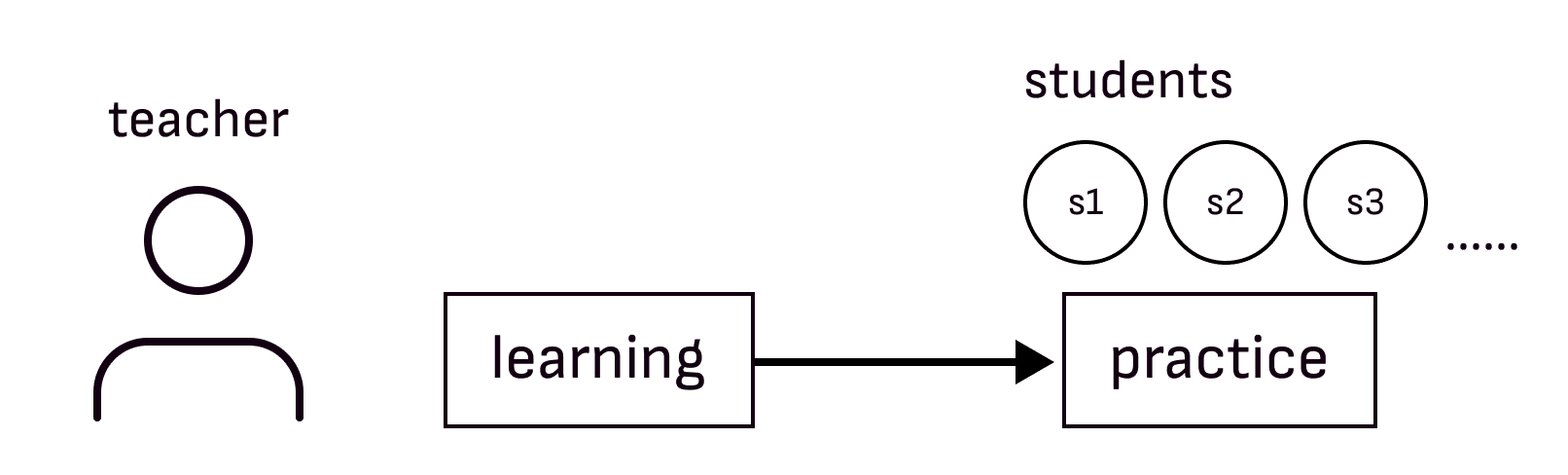
Most teachers abandon PBL not because they don't believe in it, but because the data overwhelms them.
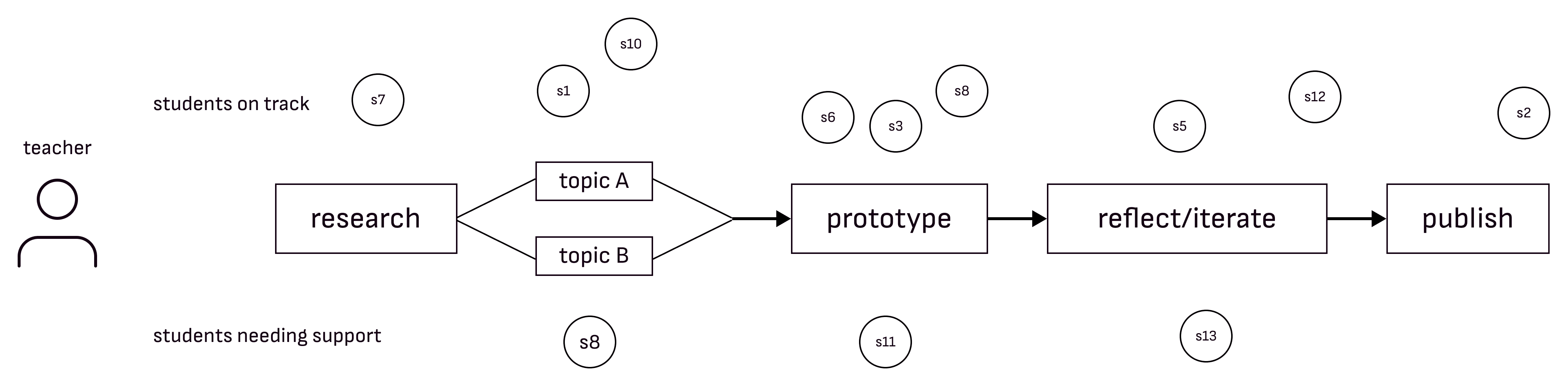
The hard part of PBL isn't the teaching. It's that every student is somewhere different, and there's no realistic way for one teacher to track all of it.
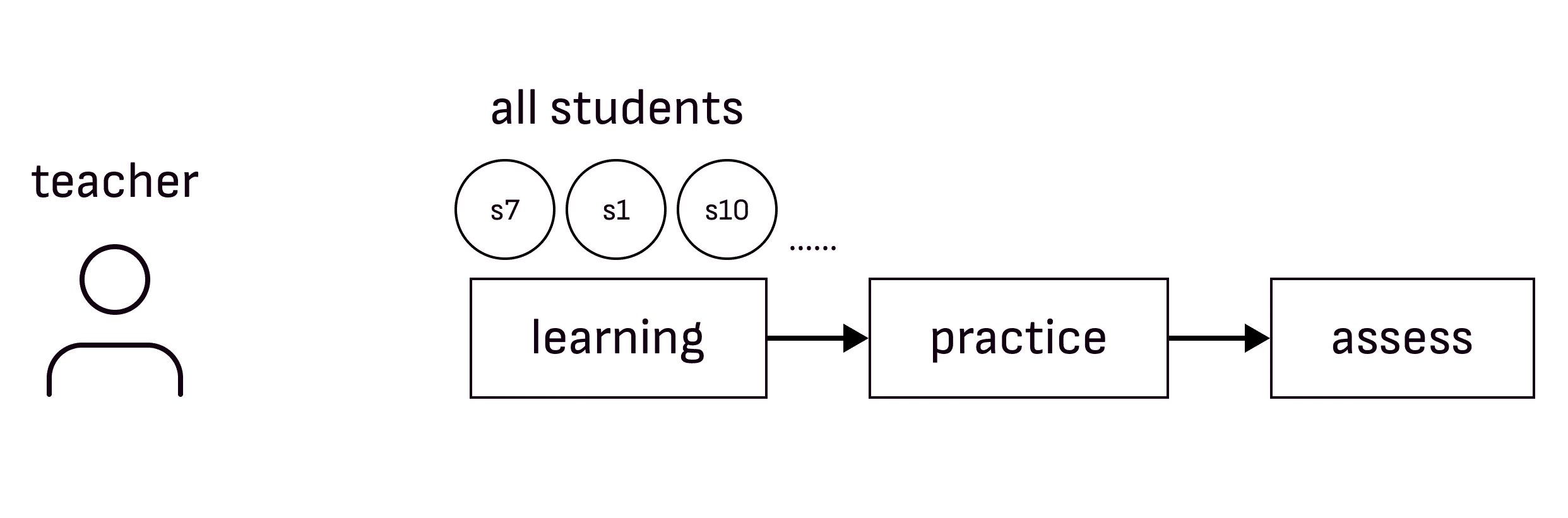
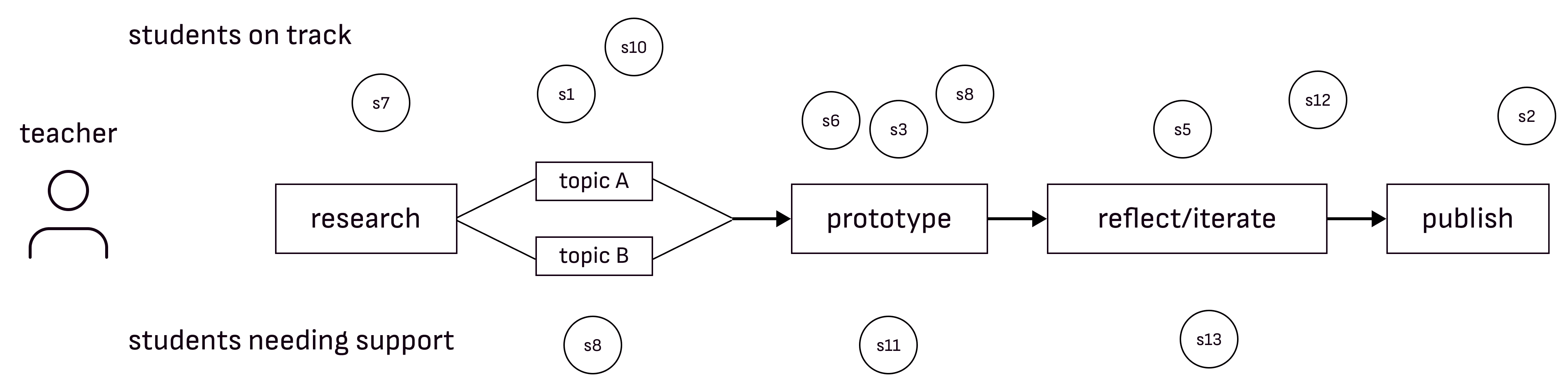
One path vs. every student on their own path
solution
REAL-TIME VISIBILITY
Students see where they are in the project
Updates as they move through each checkpoint.
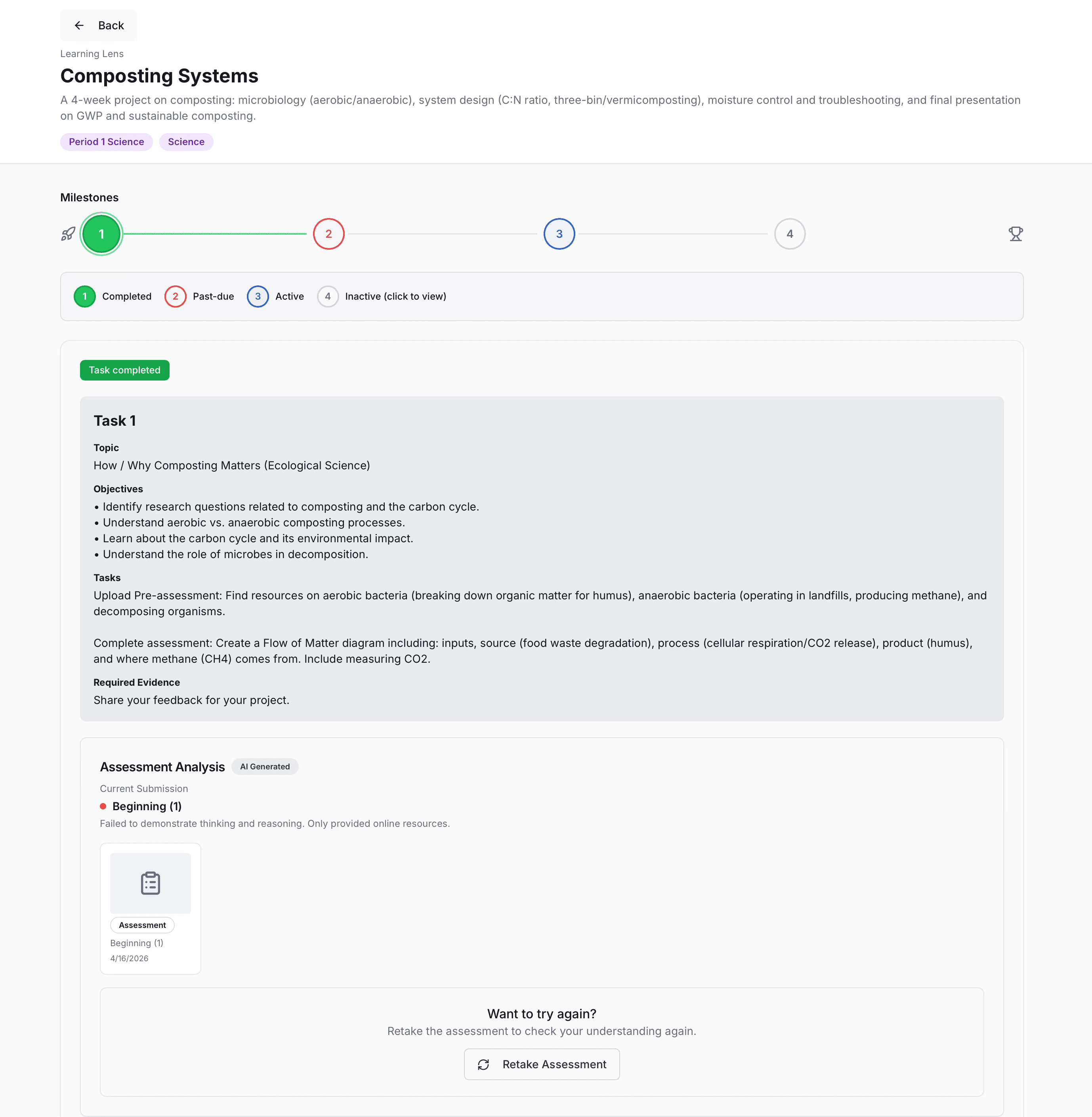
The current checkpoint is expanded, showing its state and the actions available at that point. I first designed several checkpoint cards displayed at once, but each only summarized, so a student had to click into one before they could see what to do.
ai work analysis
Teachers see what the work shows
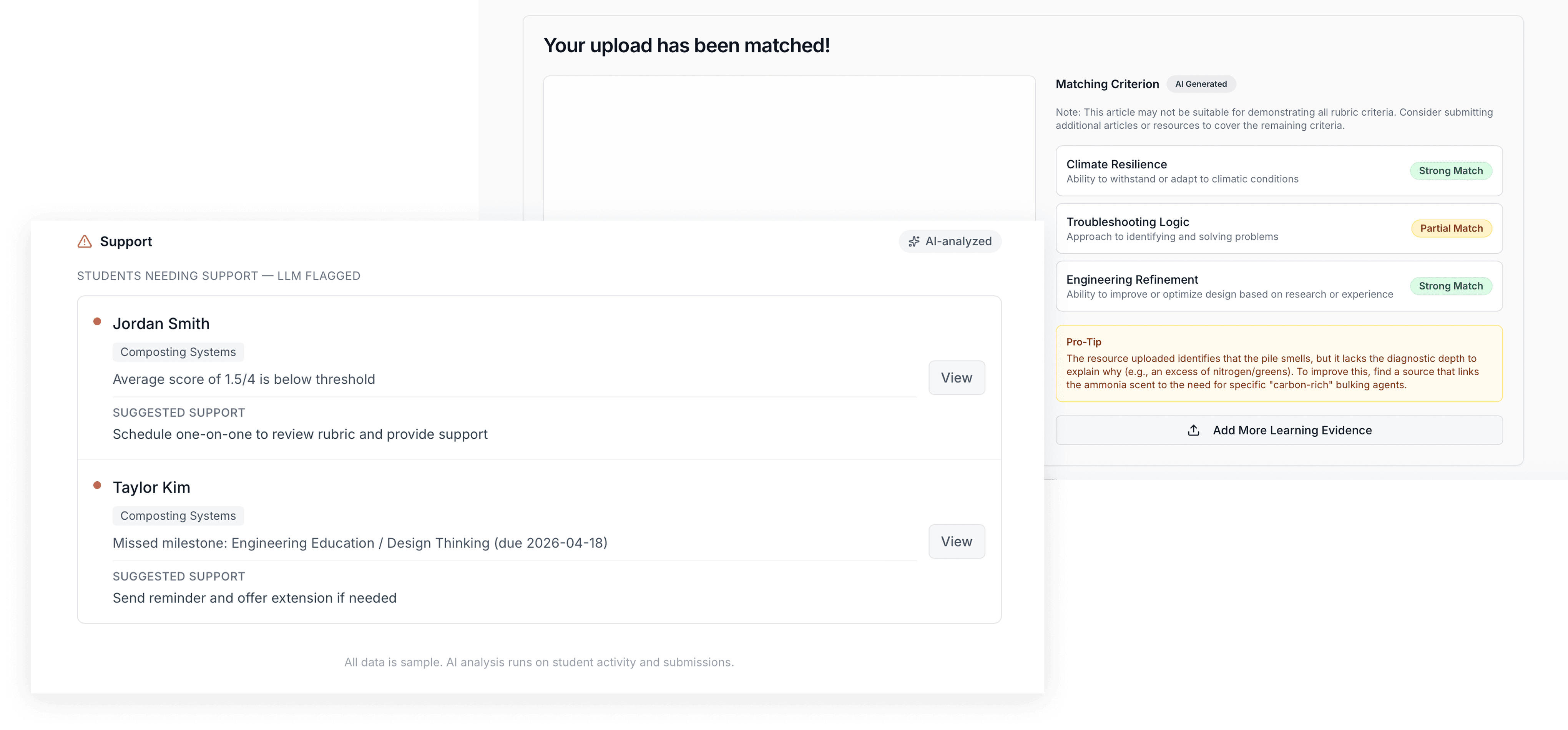
AI checks each submission against the rubric, so teachers don't have to read every one.

The rubric sits inside the flow, before student submission. The team decided the platform should carry the project details, so teachers wouldn't have to repeat them, and I put the rubric here so students see what counts at the moment they start.
teacher dashboard AND alerts
Teachers know who needs help, and what to do
Flags students who are falling behind and suggests a next step.
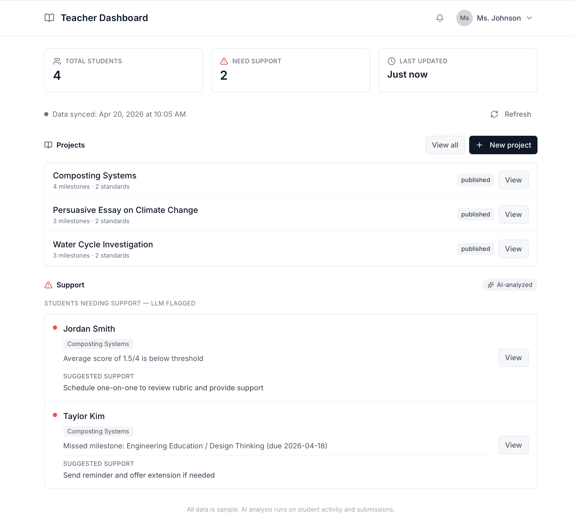
The dashboard is organized by project. I designed it around class instead, since different classes often run the same project. The engineers built it before I could walk them through the rationale, and I let it go because it didn't affect the demo.
We built it in three weeks.
Here's how we decided what to build.
Discovery & Focus
Teachers shouldn't have to chase data.
So we started by looking at what teachers were already doing.
Existing tools for teachers & Gaps
Category
Tools
Gap
AI Assistant
Magic School, Flint
Not applied to PBL student work specifically
Project Management
Google Classroom, Canvas, Schoology, Trello, Asana, Miro
Can't surface who needs help right now
Portfolio
Seesaw, Peergrade, Bulb
Captures work retrospectively, no real-time tracking
Where we focused
Once students start working, every kid is on a different path. There's no central place to track it, so teachers piece it together on their own. It adds up.
What we saved for later
Teachers set up their projects before students start. Project setup is a future opportunity, not the urgent one.
I left project setup out of scope on purpose.
The breakdown starts mid-project, when data becomes impossible to track by hand. Solving setup and tracking in three weeks meant solving neither well.
user flow
Designing for two users at once: teachers and students
We designed the flow so student work is automatically analyzed by AI against the rubric, and the results surface to the teacher in real time.
Student and teacher flows showing how every student action triggers a teacher response.
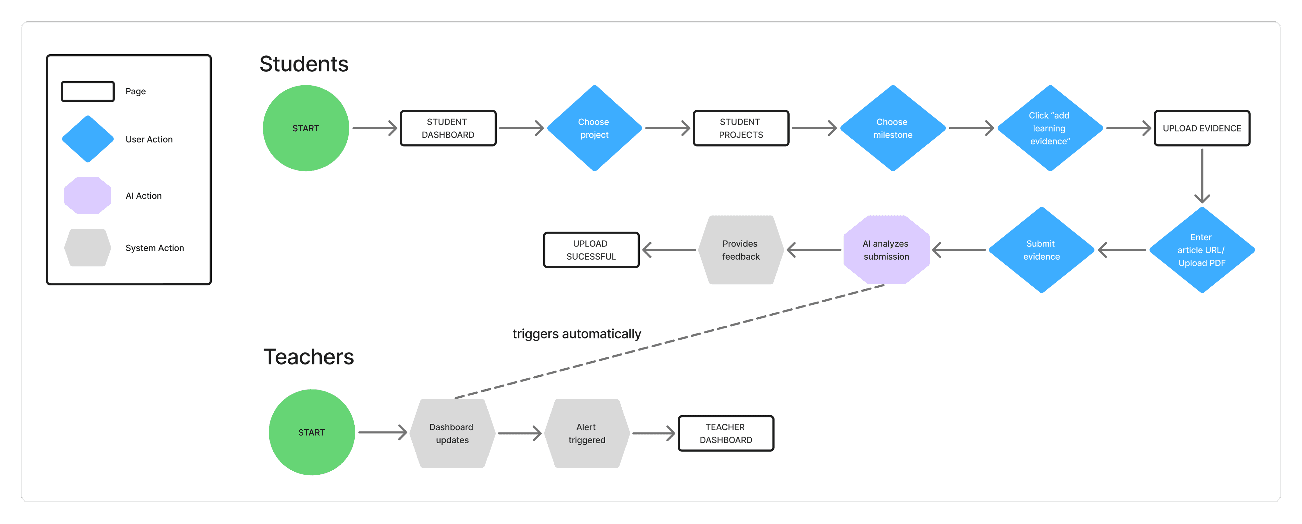
I made the result of student submission trigger dashboard updates.
If teachers have to pull the data, we haven't solved the problem.
design process
Wireframes to handoff to QA
wireframes
Students demonstrate learning differently at each PBL stage, so a status had to show more than done or not done: where a student is in the project, and whether the checkpoint is open to them yet.
Mid-fi screens: two levels of state.
The milestone card's four states
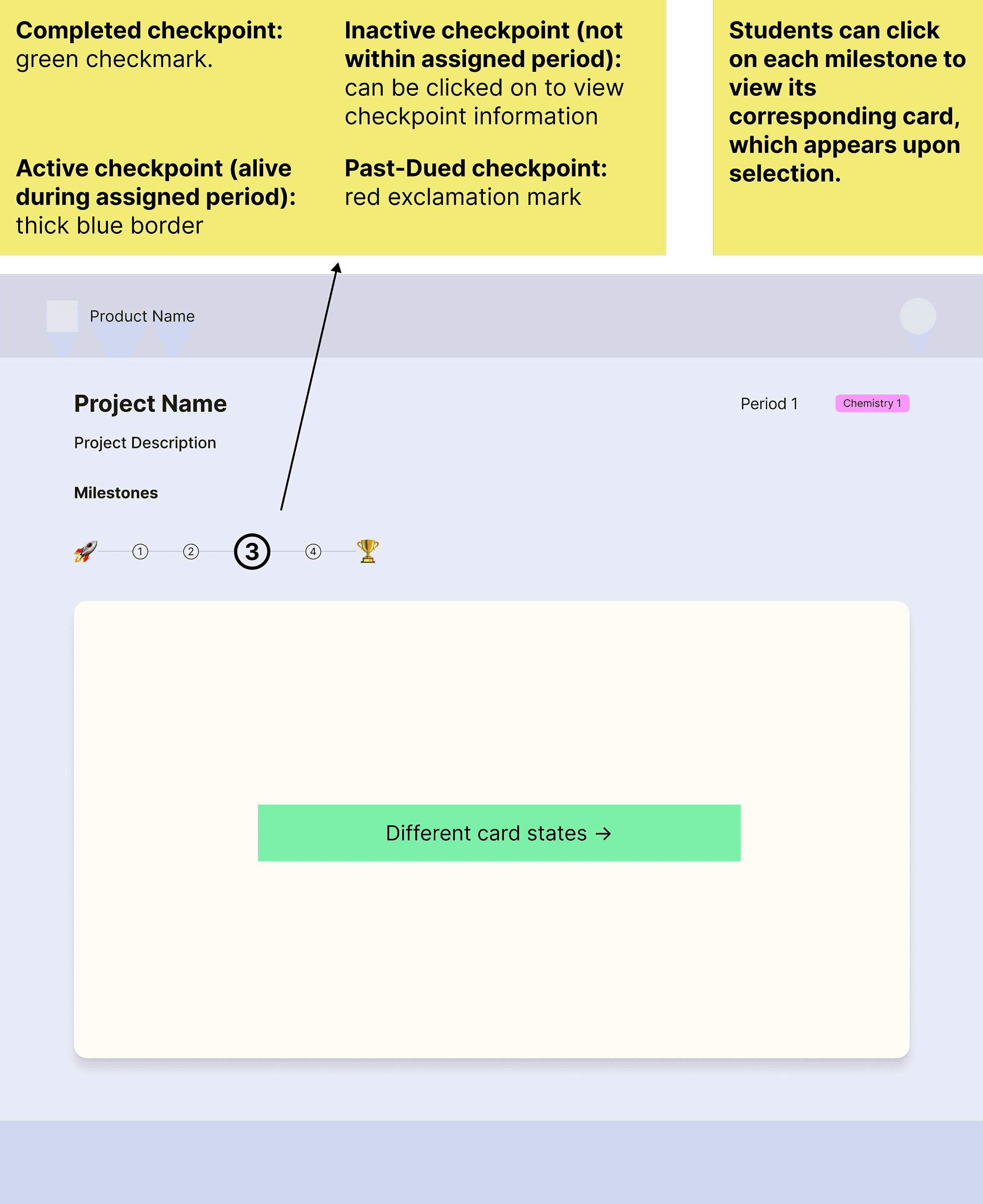
The four states a student moves through inside a single checkpoint.
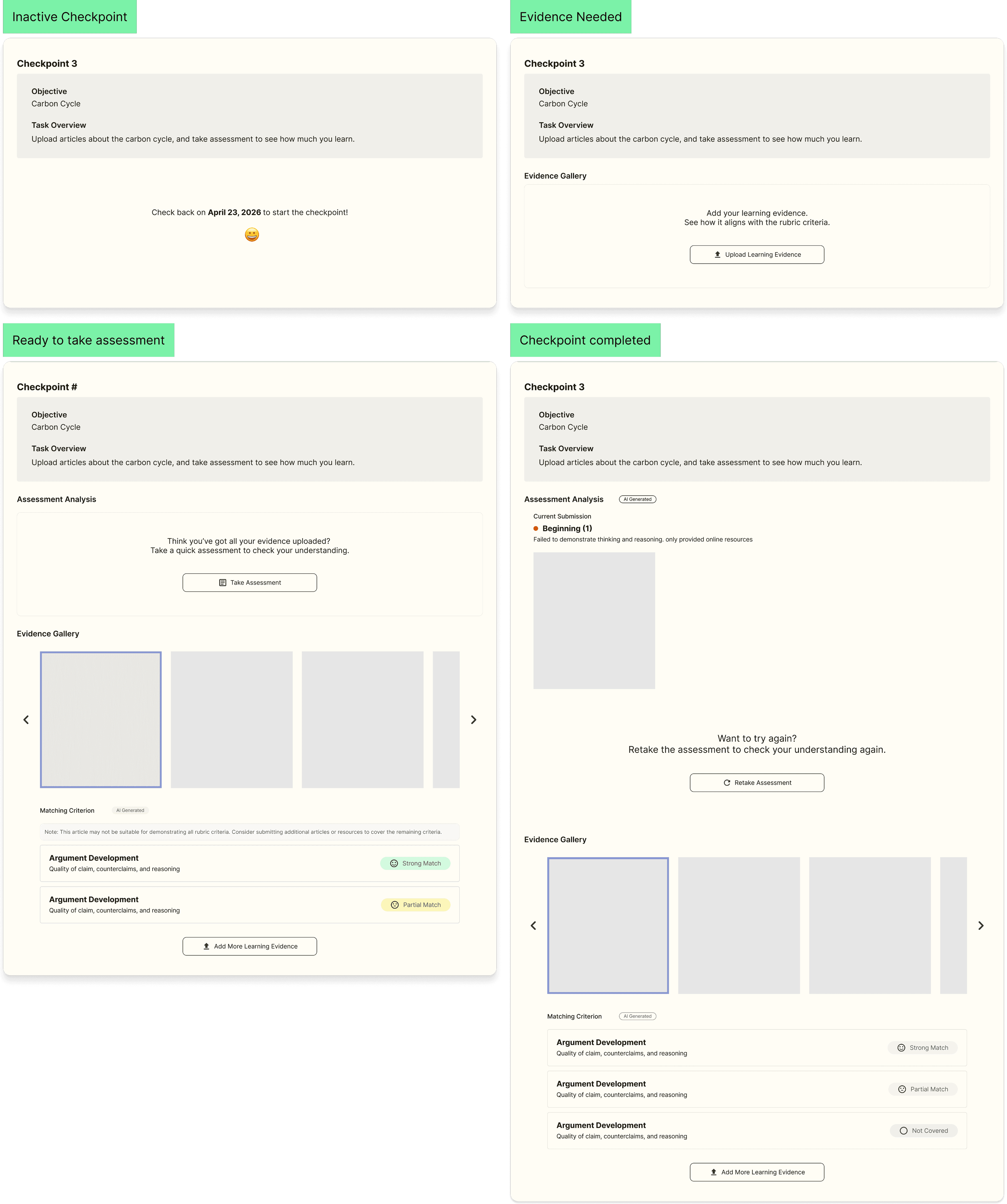
I designed four states at two levels, so students and teachers can see where they are in the project and inside each checkpoint.
The card shows completed, active, inactive, or past-due. Inside a checkpoint, a student moves from locked to evidence needed to ready for assessment to complete.
DESIGN QA
Because the UI was engineer-generated, QA was my main tool for protecting the design intent. I annotated priority fixes across multiple rounds.
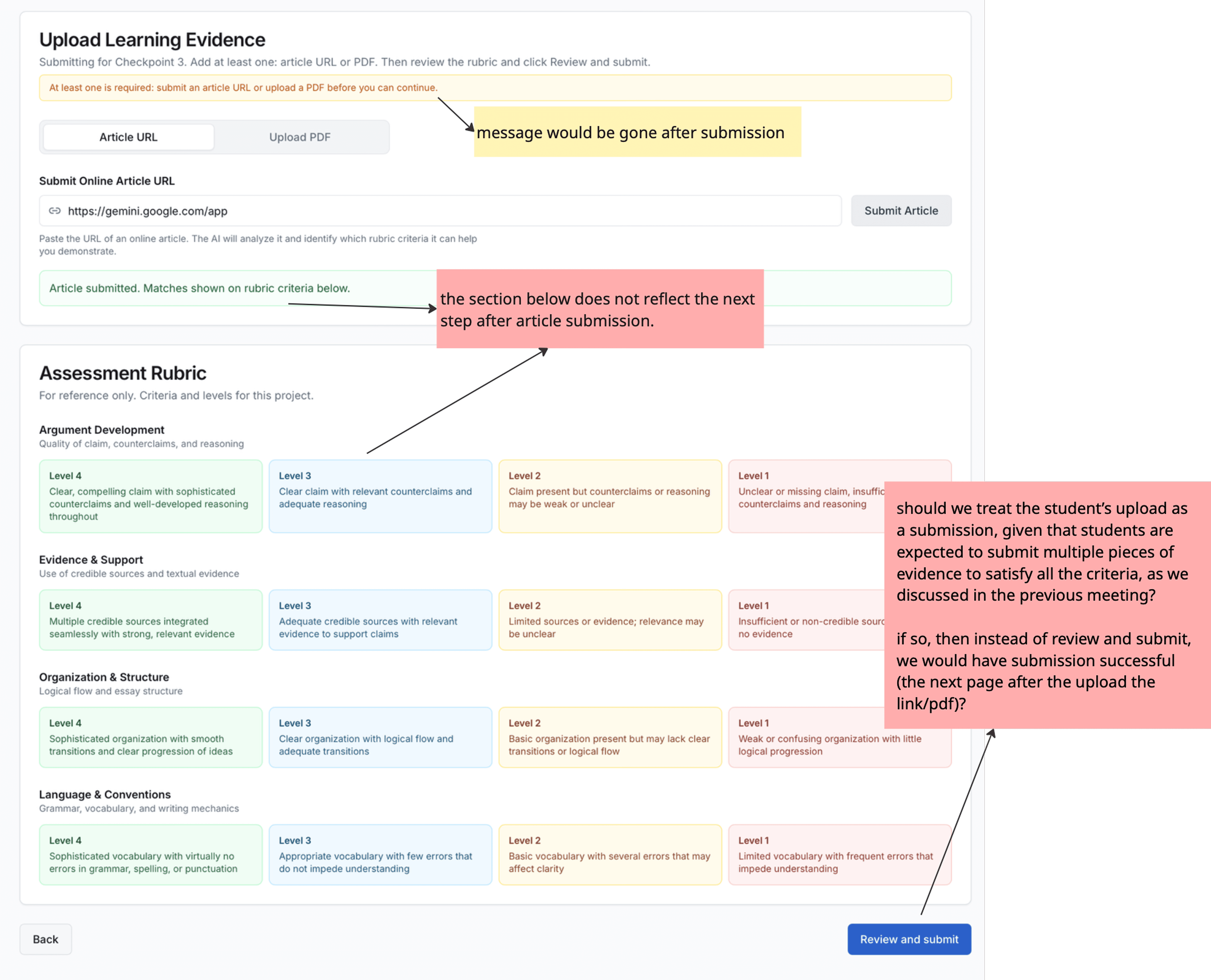
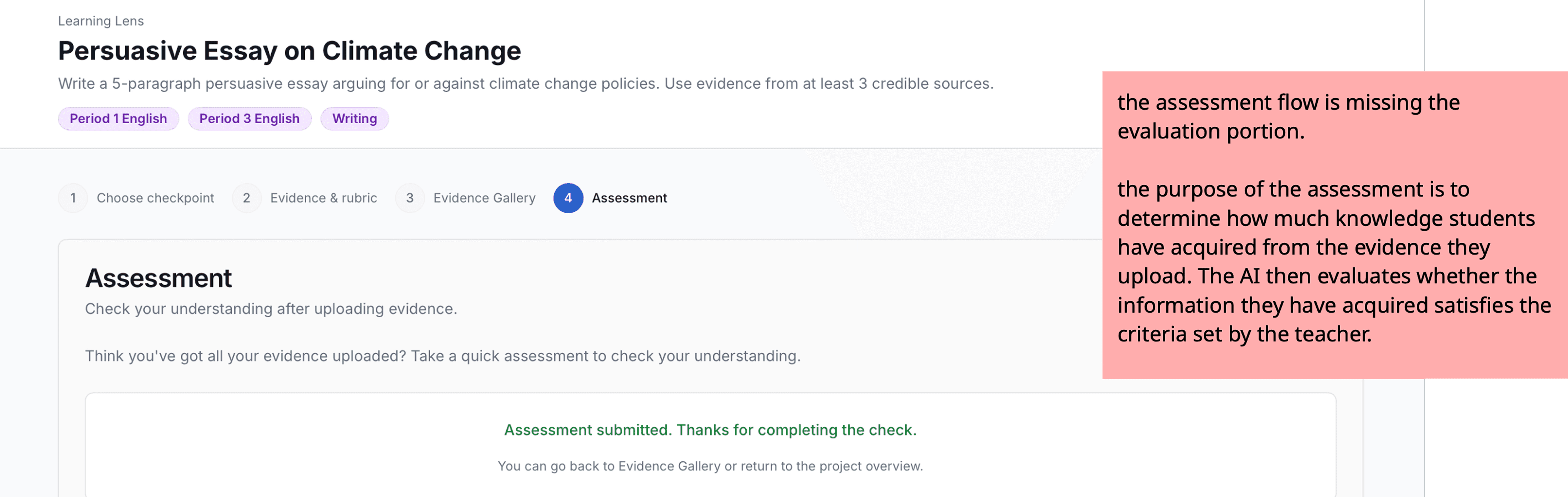
I didn't build the UI, so I fought for it in QA instead.
I prioritized fixes that would affect the demo, and let the rest go.
The project ended.
I learned a lot in the process.
reflection
Three weeks forced some tough calls. Here is what I'd do differently.
We validated with the team, not the users.
That's the real risk we shipped with. We ran out of time before we got to teachers. If I ran this again, I'd advocate for validating with teachers earlier.
The scope was right, but I didn't communicate it clearly enough to the judges.
The judges suggested showcasing the project setup experience would have strengthened our presentation. I cut it deliberately: teachers come in with their projects already set up, and our job was to solve what happens after. But I left that reasoning for the judges to infer. Next time, the first slide names what we chose not to build and why.
Turns out, knowing how to make a decision and knowing how to explain it are two very different skills.
Most of the hard calls on this project weren't in Figma. I'd make most of them the same way again.