Project
About
Process vs. Result:
How I Designed Annotation Visibility
Making student thinking visible in a second-language learning platform
The digital library showed teachers what students finished, but little about how they think. I designed annotation visibility into the workflow teachers already used, so seeing the thinking didn't cost them a new tool to learn. In testing, all six teachers completed the core tasks and most said it would help their teaching.

Project Type
Capstone project · Based on a real business problem
duration
80 hours
Team
Solo design · Collaborated with a mentor for feedback and guidance
responsibilities
User Research · User Testing · Wireframes · Prototype
Problem
Teachers chose physical books over 1,000+ digital ones.
Level Learning is a K-12 literacy platform with a digital library of 1,000+ books. Teachers had access to it. They just didn't choose to use it.
Physical books: teachers see student thinking with annotation
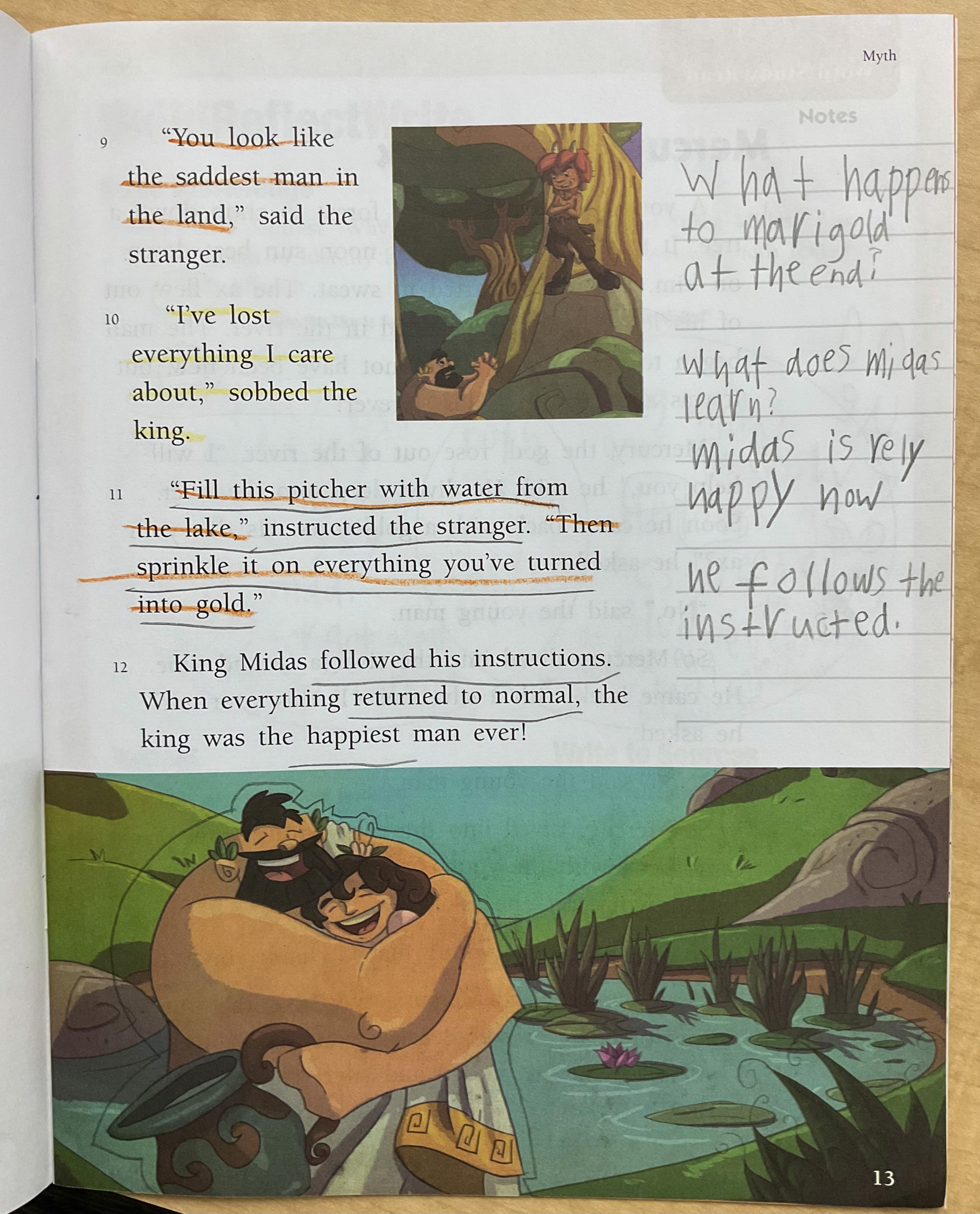
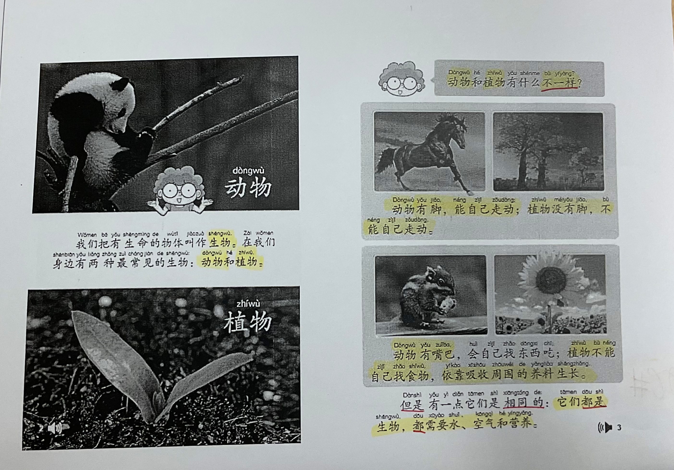
Current digital: teachers see only the end result
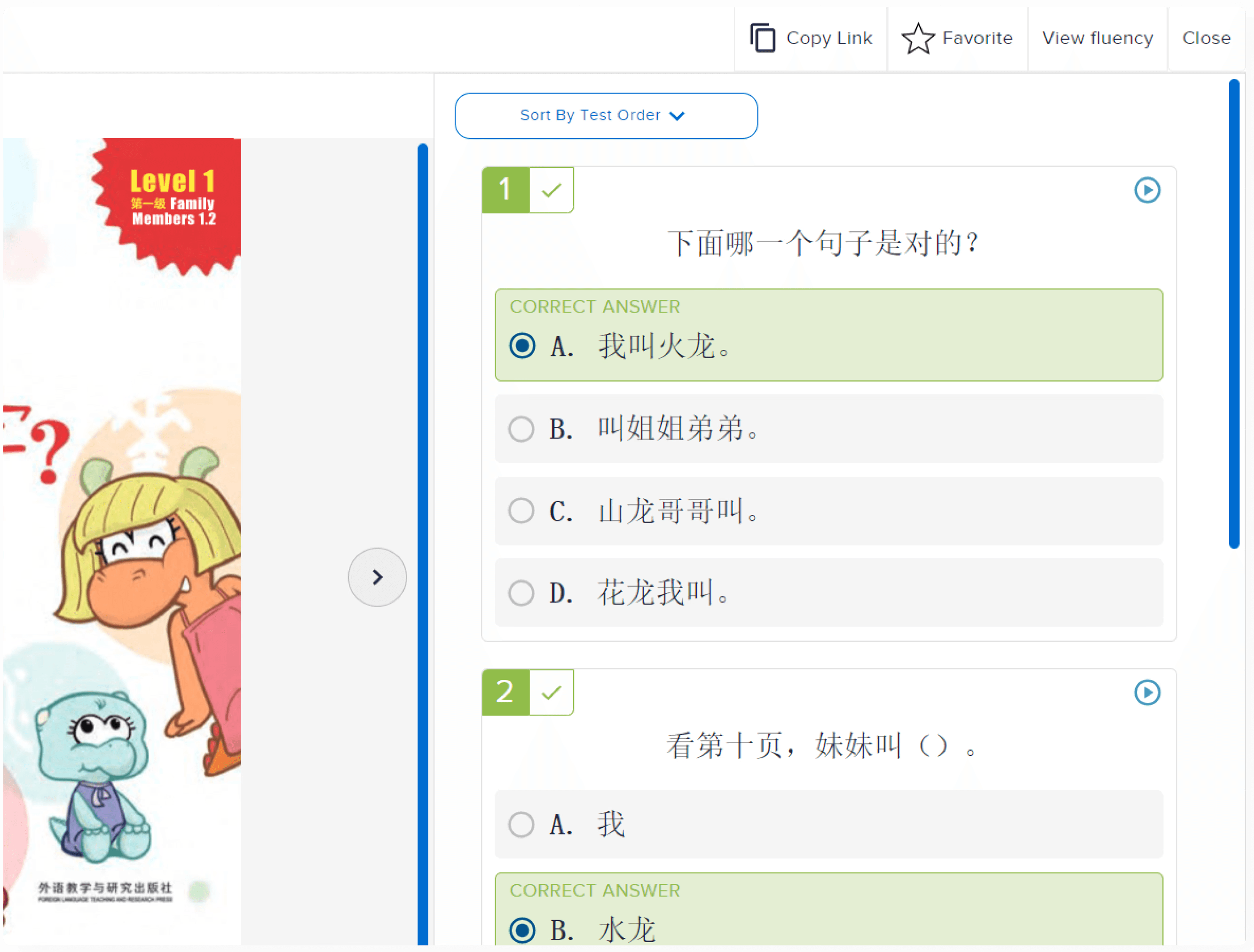
I suspected the platform was missing the tools teachers needed.
Research told me the problem ran deeper than that.
solution
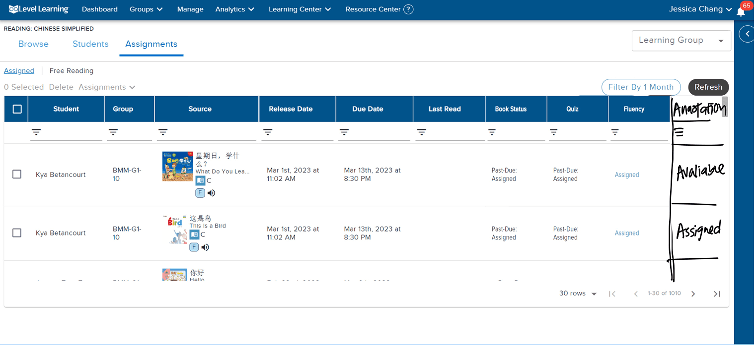
In the existing workflow
Teachers find annotations where they usually see student work.
I built annotation into the existing table, in a format teachers already knew, so there was nothing to relearn.

The new column matches the existing table style, no icon, no highlight, so it wouldn't read as a new thing to notice, just another column that was always there.
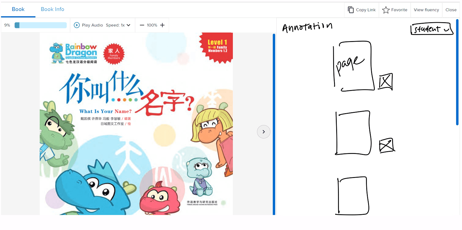
Annotation navigation
Teachers go straight to the thinking, not through the whole book
The library only supported clicking through page by page.
I built a jump function so teachers can go straight to pages where students have annotated.

Annotations reuse the same right-side panel as the existing quiz feature. I didn't design a new layout, since keeping teachers' mental model of how the platform works was the priority.
Text and voice annotation
Students capture thinking in whatever form they can
Text-only gatekeeps on writing level, especially on a second-language platform.
Voice lets every student be understood equally.

One modal per page, not per annotation type. Splitting voice and text apart would break the logic connecting them, a student's spoken note might explain exactly what they wrote.
I designed annotation visibility so teachers could stop guessing what students understood.
Here's how I got there.
research
I needed to find out what physical books gave teachers that digital didn't.
Mandarin teachers were new to reading instruction, so I interviewed English teachers first to establish a baseline for what good looked like.
Physical books let teachers see student thinking directly. Digital only showed them the result.
Interviewees' feedback confirmed that teachers needed to see the thinking, not just the result.
PRIORITIZATION
Teachers valued SEEING annotations over students CREATING them.
I had two possible directions. I chose to design annotation visibility for teachers first, because without it, giving students annotation tools wouldn't matter. Teachers confirmed it: visibility mattered more to them than the tools themselves.
"Being able to annotate is good, but I won't be able to see what they highlight…it would only be helpful if I am able to see what they annotate.”
— K. Liu, 5th grade Mandarin teacher · Supports: visibility over creation
"The annotations need to be checked by teachers, otherwise it just becomes a drawing tool, then it wouldn't be as helpful.”
— S. Dalton, 3rd grade Mandarin teacher · Supports: visibility over creation
Neither feature is valuable without the other. They only work as a pair.
Students need tools to annotate. Teachers need to see those annotations. One without the other doesn't work.
I learned what teachers needed.
I still had to decide how to build it, and what to give up to get there.
key decisions
Reducing user friction
If a teacher has to go somewhere new to see student thinking, most of them won't.
Teachers already had a workflow for checking quiz results. I put annotations there instead of asking them to learn a new one.
Accessing annotation where teachers currently have access to students' reading history
Adding annotation to the existing story page where teachers can currently view quiz results
Rejected: a three-screen path to reach annotations.
Class list, then assignments, then a dedicated annotation page, three clicks before a teacher saw what a student was thinking.
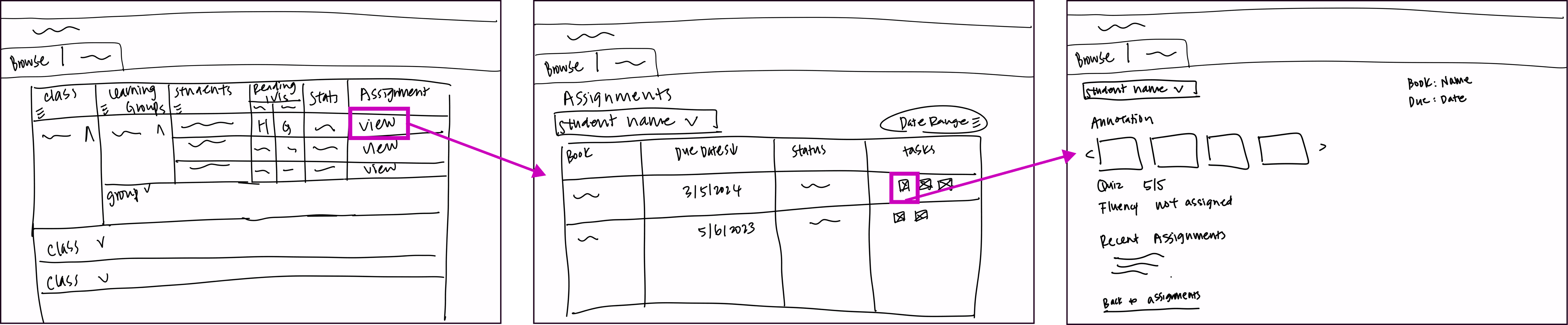
I chose the path with less friction to learn over the path with less friction to build.
Teachers were already avoiding the tool. A new destination meant one more reason to skip it.
Supporting both text and audio annotations
Ten years of language teaching told me this wasn't optional.
"I like the option of voice and written memo. This will help my lower students who can't write in Chinese yet."
— A. Yao, Kindergarten Mandarin teacher · Supports: inclusion
Voice Annotation
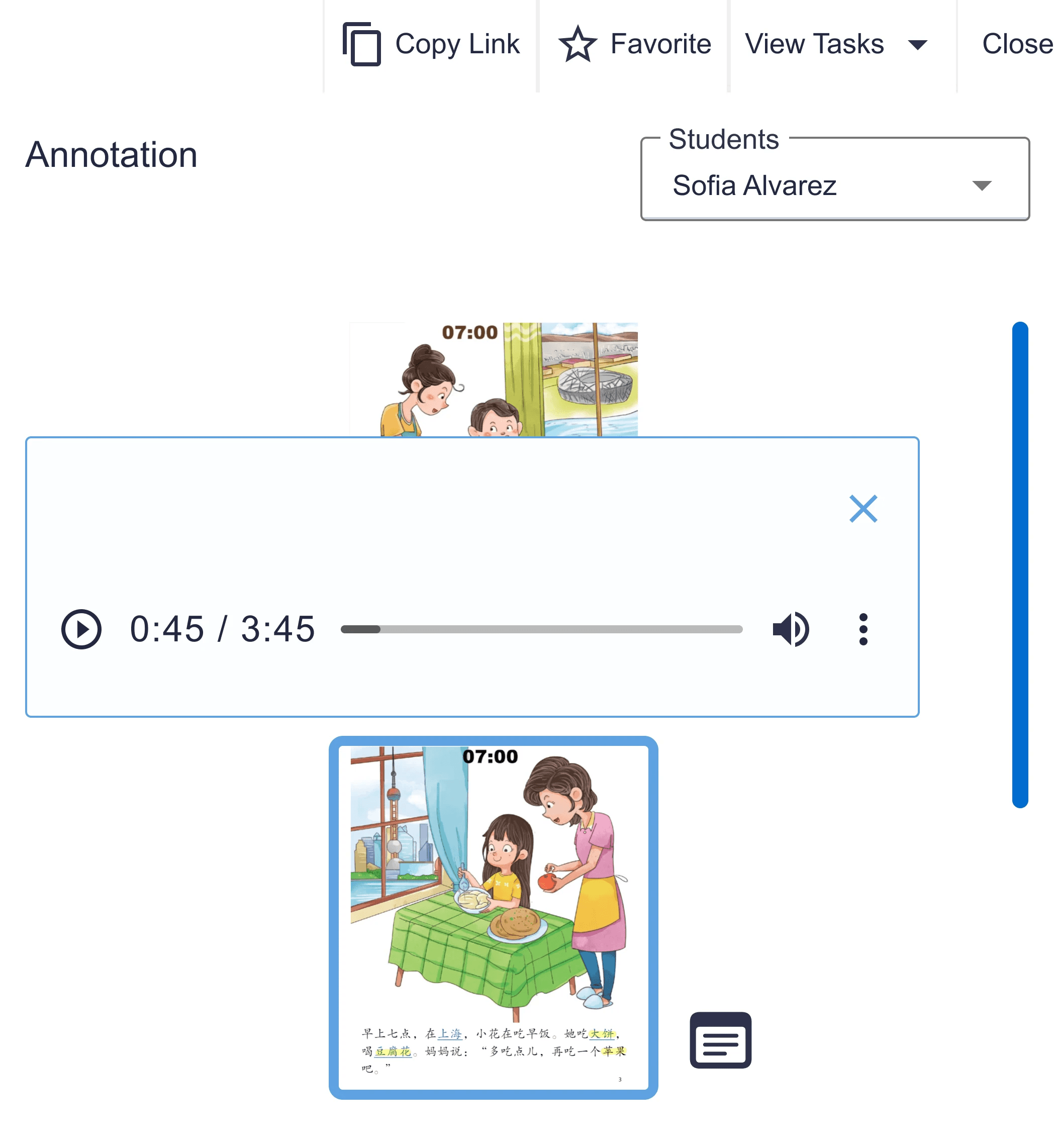
Text Annotation
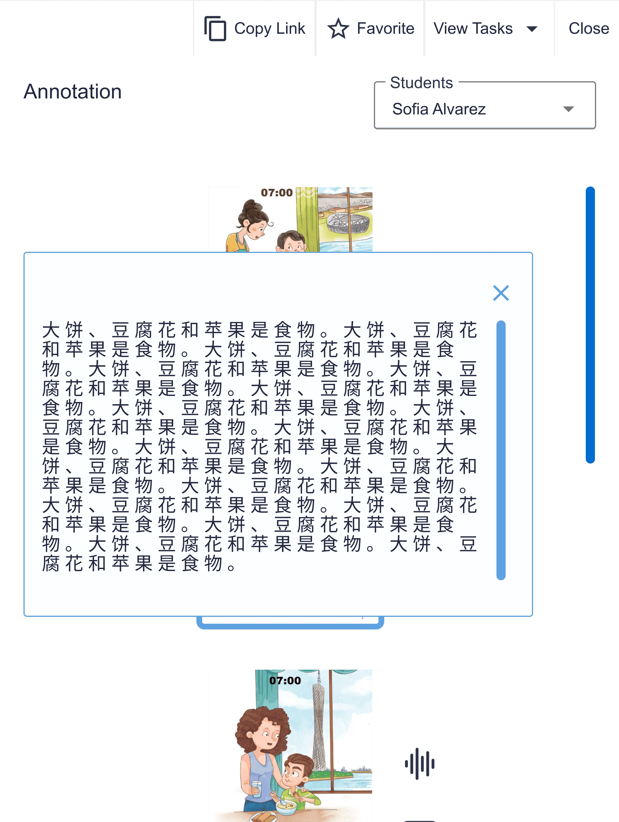
Younger students think out loud before they can write.
Adding audio annotation was an inclusion decision, not a scope expansion.
I built the thing I set out to build.
What I'd change is how I got there.
outcome
The design worked, with three friction points to improve.
6/6
completed every task within my success metric of two or fewer misclicks.
5/6
said annotation visibility would help their teaching.
Six teachers, three who taught reading in English classrooms and three in Mandarin.
Teachers looked for annotations on the page rather than beside it, missed the thumbnail panel as a way to navigate, and couldn't tell the audio icon from the note icon when both opened the same modal.
I addressed visibility, but overlooked the mental model teachers have with physical books.
Physical books put student thinking directly on the text. My panel made it findable, not obvious.
What I'd do next
Run a second round of testing to validate the changes I made to placement, discoverability, and status labels
Split audio and text into separate entry points
reflection
I should have concept tested before deciding what to build first.
Research confirmed the problem, not the hypothesis of my solution.
Ten years of teaching made annotation tools feel like the obvious gap. I went into interviews expecting research to confirm that direction, and it did confirm the problem, just not the solution. Teachers weren't avoiding the library because they lacked tools, but because physical books gave them a window into seeing student thinking through annotation.
My teaching background helped me ask the right questions, but coming in with a solution already in mind limited how creatively I approached solving it. What I'd do differently: after interviews, bring rough concepts to test with teachers and see which one resonates more before committing to build.
Concept testing early avoids wasted effort on the wrong direction.
Asking the right questions in research got me to the right problem, but I skipped the step that would have gotten me to the right solution sooner.